Using graphic design principles to create social posts people will love
Graphic design is the process of visual communication and problem-solving through the use of typography, photography, and illustration. It is used to express ideas or concepts in a simple, concise, and effective way. This presents a great opportunity for branding.
If your current marketing strategy is all about getting more visitors, your focus will be on the first impression your venue makes. Much like planning the interior of your hotel, restaurant or spa, the key is in the design. Typically, and particularly if you are aiming for the higher, more luxury end of the market, you wouldn’t just turn up at the local IKEA and get a bunch of furniture and equipment. Interior design for a hotel is a complex task as each space must be functional and aesthetically pleasing. When selecting furniture and accessories, it is important to consider the type of clientele the hotel will serve. For example, a luxury hotel might feature expensive objets d’art and luxurious bedding, while a budget-friendly establishment might opt for more utilitarian furniture and fixtures. Similarly, lighting should be chosen based on the scene being depicted; bright lights might be appropriate for an upscale restaurant or lounge area, while subdued light may be more fitting in a quieter room. In order to create an inviting environment that will please all guests, it is important to have a clear vision for each individual room.
Now imagine your interior as the content of your social posts and e voilà, you are in the planning phase of a design campaign with similar design principles, on a different medium.
Think about the audience when creating social posts. You want to make sure that your posts are appealing to the people who will see them. For example, if you are posting about a new product, make sure that the images and language are attractive and easy to understand. If you are posting about a charity event, make sure that the images look like they would be appealing to donors.
Another important consideration is how your post will be interacted with. Make sure that all of your social media posts have a purpose and are designed to appeal to specific audiences. This will ensure that your posts receive the attention they deserve and help you reach your goals more easily.
Apply design principles
There are a few ways to use graphic design principles when creating social posts. One way is to use strong typography and imagery to create an interesting and engaging piece. Another is to use effective layout and composition to help organize the information in a way that is visually appealing. Additionally, using pop culture references or clever humor can really make your posts stand out. By taking these into account, you can create content that people will love and want to share!
Here are some key principles of graphic design that can help you create social posts that people will love:

Hierarchy in graphic design
A graphic design hierarchy is a set of rules that dictate how a design should be arranged. The hierarchy starts with the most important elements in the design and works its way down to the least important elements.
The first step in creating a hierarchy is deciding what the most important element of your design is. This might be the headline of your post, the focal point of your image, or even the message you are trying to communicate. Once you have determined what is most important, you can start to create a structure for your entire graphic design.
For example, if you are designing a social media post about going on vacation, your most important element would be the headline. You might want to place this headline in an image with plenty of space around it so that it looks bold and clear.
Whilst there is a temptation to have all the information appear big and bold, there generally should be just one – yes, really just one single message. Anything more, especially in the small format of social media with the fleeting attention span given to posts, and it will get diluted and forgotten like too many items in the mental shopping list.
Hierarchy works well with the other principles of design – or more precisely, they work hand in hand, enabling each other when used correctly. This principle needs Balance, alignment, white space and contrast to shine.
For balance and contrast, use a clear and powerful font for your text. Make sure that the font is large enough so that people can read it easily, and use a typeface that is easy to identify and remember. Have a distinct style for your headlines, body copy and decorative elements. Make sure there is a balance of key message, images and white space.

Balance in graphic design
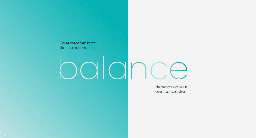
Balance is a key principle of graphic design. It refers to the idea that elements in a design should be equal in size, color, and placement. This helps to create a balanced design that is visually pleasing to the eye.
When creating a social media post, it is important to keep the overall message in mind. This means that elements such as font choice, layout, and color should all work together to create a cohesive look and feel for the post. It is also important to consider what will grab attention and make people want to read on.
For example, posts about breaking news or important events should use more dramatic elements than posts about everyday happenings. Similarly, posts aimed at younger audiences could use brighter colours and different visual elements to those aimed at older audiences.
Balance text and graphics equally within your posts. While graphics can add interest and excitement to a post, make sure that the text is still legible and easy to understand.
Balance is created by carefully choreographing the different parts of your post – your headline, image or graphic, any body copy and call to action. Sometimes balance is achieved by creating What gives it balance is the use of contrast, the way it’s aligned, the white space and the use of a hierarchy…
You can guess where this is going…
White space as a design principle
In my mind, the glue that holds it all together is white space. White space is the empty areas between elements on a page or screen. It can be used to create a clean and organised look, or to add emphasis. It gives your messages room to breath, it invites the eye to linger long enough to take in what you are trying to communicate, and it makes things easy to read.
One way to use white space in your social posts is to leave room between your text and images. This gives your posts space and makes them look more polished. It allows readers to scroll down without feeling overwhelmed by information or having to guess what you actually want them to take away from this.
Another way to use white space in your social posts is to use fonts that are thin and light. This will give your posts a flowing aesthetic, as well as make them look more modern and up-to-date.
White space is amazingly powerful to create contrast, another important principle of design.

Worship the extremes
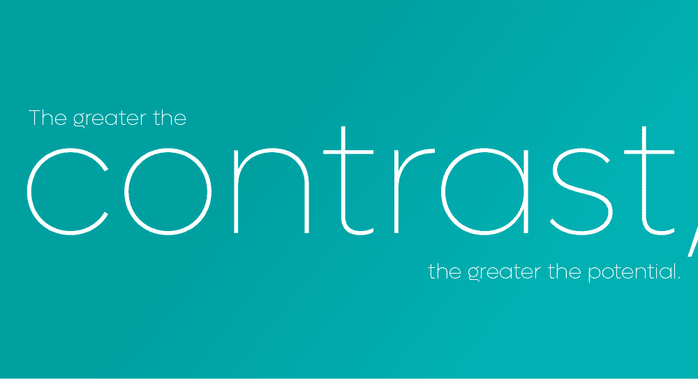
Contrast makes our brains light up when glancing at a post. Contrast can be found in the size, color, and placement of elements on a page. When used correctly, contrast can be one of the most effective ways to grab someone’s attention and keep it. For contrast to work, you need to make sure it looks intentional, and not like a mistake. It therefore must be strong and obvious.
A question of left, right or centre
Using alignment helps you to create a balanced and organised visual hierarchy in your design. This means that all elements are placed in an order that helps people understand and interact with the content of your design.
When creating a social media post, it’s important to follow the same principles of alignment as you would in any other design project. This will help your posts look cohesive and professional, while also appealing to your target audience. Choose a focal point for your post. Select one element or group of elements that you want people to focus on when viewing your post. This can be anything from the title of the post to the main photo or video. Make sure the content itself is engaging and interesting. People will be more likely to share your post if it is powerful, easy-to-grasp and eye-catching.
There are typographic alignments we are familiar with from many applications. You may choose to left or right align your content. Or you could centre it – something that works well for small pieces of information with plenty of white space surrounding them. You could even justify your copy or visuals, but beware to avoid unsightly forced gaps that create an unbalanced look and feel.
Alignment also works hand in hand with contrast. Beware to not mix alignments on a small area – e.g. left and centred. It’s a powerful design principle that works best when treated with consistency and confidence.
Design. Apply. Repeat.
Graphic design is all about creating a consistent look and feel for your content. Repetition is one of the most important principles to follow when creating social media posts. By repeating certain elements, you can create a more unified look across your posts and make them easier to read.
For example, using a similar font size and color on all of your social media posts can help readers easily identify each post. Plus, by using consistent visuals, you can create a welcoming and engaging experience for your followers. Repetition creates a sense of familiarity and comfort for users, making them more likely to return to your site or social media post again and again.
By using repeated images, typography, or color, you can create a cohesive and visually appealing brand identity for your website or social media page. For example, if you have a blog about gourmet food, you could use images of recipe preparations or food ingredients as part of your blog’s header or footer throughout the site. You could also use similar typography and colours in your blog posts and social media posts to create a cohesive look and feel. Another simple element is to use a brand icon repeatedly on the posts to create a feeling of consistency in your social posts.

Get in touch with us if you want to help with your content creation. We can setup templates for your social media campaigns or advertising with powerful designs that tell your story.

Regine Wilber
I am a brand consultant and conceptual designer. I love using creativity to solve problems for our clients. Ever since rebranding a hotel group in the Cotswolds, I’ve been in love with the hospitality industry.


